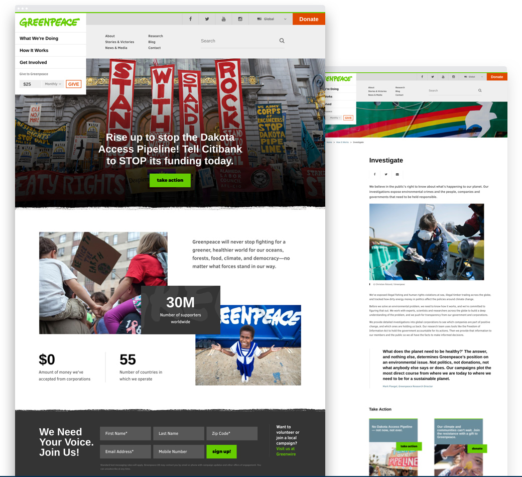
Greenpeace USA came to us wanting to do something incredibly ambitious: launch a brand new, state-of-the-art website on a new content management platform in three months. They shared with us that Greenpeace was in the midst of a brand evolution. While they wanted to continue to promote their legacy of protecting our environment and our animals, recent research showed that a more inclusive brand identity was winning out with younger audiences over the more aggressive, hard-hitting reputation of Greenpeace’s past.
Why Echo&Co
To help rebrand Greenpeace USA for the future, our team’s early discovery centered around visual storytelling and creating a new narrative arc for the organization, especially one that avoided the text-heavy presentation of their old site. Because of the aggressive timeline and limited resources for the project, our teams determined that a one-day “content and UX boot camp” to define the vision for the site and strategic approach would be the best setting for a complete re-envisioning about how Greenpeace reaches its U.S. audiences online.
Content Inventory, Audit, & Gaps Analysis
Content Strategy & Definition
Information Architecture
User Experience Definition
Responsive User Interface & Interaction Design
WordPress Development
Evolving the online strategy
Greenpeace USA had a high volume of organically grown content that was very nuanced in nature, communicated programmatically, was technical, dense with text, and lacked a central narrative arc. We led Greenpeace USA through a complete online brand and content overhaul, which became the foundation of the new site experience.
Delivering modern visual design
The visual aesthetic of Greenpeace.org/usa was plain and outdated, and did little to drive the kind of engagement Greenpeace easily inspires in the field. We created a new, open, and modern visual aesthetic that emphasized and drew from Greenpeace’s stunning photography, giving it the feel of both a publication and a gallery.
Instilling a sense of purpose
The site was passive, and did not convey the sense of energy that Greenpeace supporters, volunteers, and staff feel. Through user journey modeling, our teams determined the needs, motivations, and pathways through the site that would lead to increased user engagement and conversion.
The site launched to great reception in July 2015 and has since been featured in roundups of the top nonprofit websites. Greenpeace China reached out with interest in applying the site design and experience locally and other international offices have expressed interest in using the new Greenpeace USA experience and platform for their own sites. One significant goal of the Greenpeace USA team was to use the site as a proof-of-concept to pitch a multisite WordPress installation for Greenpeace International. They have been using the new Greenpeace.org/usa as a tool for change and innovation within their organization.